
When Fonts Get Racist: The Problem with “Stereotypography”
Why your typeface choices might be saying more than you think.
If you’ve ever looked at a menu written in a “chopstick” font or seen a Western-themed logo that screams “yeehaw” with cartoonish serifs, you’ve witnessed stereotypography (a term coined by Graphine).
Designers, marketers, and brand builders wield typefaces as tone of voice. They signal emotion, personality, history. But what happens when those signals are rooted in caricature, colonialism, or reductionism?
Spoiler alert: it’s not a good look.
What Is Stereotypography?
Stereotypography is the unspoken (and often unintentional) act of stereotyping cultures through type. It’s the visual equivalent of an accent performed badly.
It’s when typefaces are used to “represent” a culture, ethnicity, or language through exaggerated or inauthentic stylistic cues.
Think:
Fonts that mimic brushstrokes to “look Asian.”
Fake Arabic calligraphy for “Middle Eastern” branding.
“Tribal” display fonts meant to evoke Africa but designed by someone who’s never been south of Spain.
Or “Cinco de Mayo” fonts dripping in chili-pepper kitsch.
This practice isn’t just cringey — it’s culturally flattening. It reduces entire regions, languages, and histories to a single visual shorthand and a monolithic expression.
And unfortunately this practice has become so pervasive in our society that we’ve come to recognize and assign these tropes unconsciously.
A Little Typeface History Lesson
Typography has always reflected power and perspective.
The first movable type system dates back to 11th-century China (Bi Sheng, Song Dynasty), but it was Johannes Gutenberg’s 15th-century Latin script press that reshaped global communication — and eventually, colonialism.
Fast forward a few centuries, and type became a vehicle for selling identity. During the 19th and 20th centuries, as Western nations expanded their reach, display type exploded. Printers in Europe and America began creating “exotic” typefaces to market imported goods and foreign-themed entertainment — everything from “Oriental Express” to “African Safari.”
It wasn’t cultural appreciation. It was commodification.
Some infamous examples (that I love to hate):
“Chop Suey” Fonts (a.k.a. Wonton, Rickshaw, etc.)
These faux-Chinese display fonts, common on restaurant signage, emerged in early 20th-century America. Their jagged, brush-like strokes were created by white designers to look “oriental.” They’re not based on any real Chinese calligraphy system — just an outsider’s interpretation of “foreignness.”
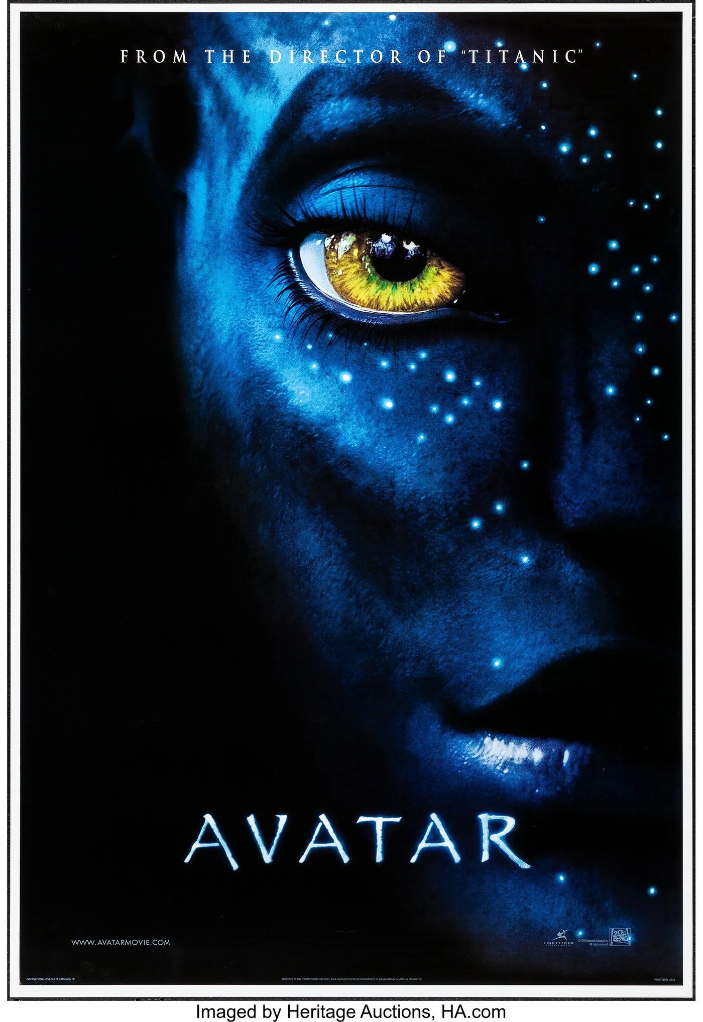
“Papyrus” (1982)
You know it. You’ve seen it. You’ve probably mocked it.
While not explicitly racist, Papyrus became a global shorthand for anything “exotic,” “spiritual,” or “ancient.” It’s been used for yoga studios, “Middle Eastern” restaurants, and of course, Avatar. The problem? It flattens dozens of distinct visual languages into one generic “ancient world” aesthetic.
“Neuland” (1923)
Created by Rudolf Koch, Neuland was inspired by woodcuts and often used in African and Indigenous-themed marketing in mid-century advertising — despite having no connection to those cultures. Its blocky, rugged forms were co-opted by Western brands to signify “primitive” or “tribal.”
“Lithos” (1989)
Designed by Carol Twombly for Adobe, Lithos borrowed from Greek stone engravings but was quickly co-opted by tourist traps and Mediterranean-themed logos. It became the go-to for anything vaguely “ancient” or “ethnic,” reducing an entire classical culture to a stylistic trope.

Why It Matters
Type carries meaning beyond aesthetics.
When brands use fonts as costumes, they perpetuate the same systems of “othering” that exist in language, film, and media. Stereotypography can:
Reinforce cultural clichés (“Asian = brush script,” “African = rugged woodcut”).
Erase typographic diversity (e.g., actual script, handwritten practices, and type from other global communities)
Signal inauthenticity and alienate audiences who recognize the caricature.
Undermine the credibility of your design and brand.
It’s not about policing creativity — it’s about intentionality. Using cultural inspiration thoughtfully requires understanding, collaboration, and respect.
What Designers Should Do Instead
1. Do your homework.
Before reaching for a “worldly” display font, research the actual typographic traditions of that culture. Many regions have rich design histories — Arabic calligraphy, Indian Devanagari, West African Nsibidi, Japanese Kanji — all distinct and beautiful.
2. Go to the source, don’t imitate.
Collaborate with designers or typographers from the culture you’re aiming to represent. Commissioning original work ensures accuracy, avoids appropriation, and adds authenticity.
3. Avoid the “accent” trap.
If the only reason you’re choosing a font is because it “looks foreign,” step back. What message are you really trying to send? Could color, photography, or copy convey your intent better?
4. Question legacy fonts.
Many “ethnic” fonts were designed in eras of blatant racism. Just because it’s in your font library doesn’t mean it deserves a revival.
5. Tell a deeper story.
Good design connects through emotion and context, not costume. Honor the real culture, don’t caricature it.
The Future of Typography Is Global (and Respectful)
Today, we’re seeing a new wave of designers reclaiming and revitalizing their typographic heritage.
From Zuzana Licko’s exploration of digital-era fonts to Tre’ Seals protest poster typefaces, the type world is finally expanding beyond Eurocentric boundaries.
Platforms are beginning to champion diversity and accessibility in letterform design making it easier to find typefaces created by the cultures they represent.
This is the kind of typography the world needs more of: rooted, researched, and real.
Final Thought: Fonts Speak — Make Sure Yours Says the Right Thing
Stereotypography doesn’t always come from malice.
Often, it’s a shortcut, a way to signal culture fast. But shortcuts tend to skip the nuance. And nuance is where humanity lives.
So the next time you’re designing a menu, a campaign, or a brand identity and you think, “This font feels ethnic,” stop and ask:
“Ethnic” to whom?
And why does it have to feel that way?
Because in design, as in culture, respect is the most timeless font of all.