
Is Your Brand Color Blind Friendly?
Last updated: March 5, 2026
Honey, let's talk color palettes. Color is one of the most powerful tools in your brand's visual identity — it sets the mood, triggers emotion, and makes you instantly recognizable. But here's a question most designers and business owners skip right past: can everyone actually see what you're trying to say?
Color blindness affects more people than most brands realize. According to the World Health Organization, approximately 300 million people worldwide experience some form of color vision deficiency and with 5–10% of the American population included in that number, there's a very real chance a meaningful slice of your audience is experiencing your brand in a way you've never considered.
The good news? You don't have to scrap your palette or start from scratch. You just need to be a little more intentional about how you use it.
What Is Color Blindness, Really?
Color blindness is rarely total, most people who have it can still see color, just not in the same way you do. There are a few main types worth knowing:
Red-Green Color Blindness (the most common)
Deuteranomaly — greens appear more red; the most common type overall
Protanomaly — reds appear more green and less bright
Protanopia and Deuteranopia — complete inability to distinguish red from green
Blue-Yellow Color Blindness (less common, but still significant)
Tritanomaly — blue and green are hard to tell apart, as are red and yellow
Tritanopia — difficulty distinguishing blue from green, purple from red, and yellow from pink
Achromatopsia — full color blindness, where the world appears entirely in shades of gray. Rare, but real.
It's also worth noting that color blindness affects men disproportionately — about 1 in 12 men experience it, compared to roughly 1 in 200 women. If your audience skews male, this is especially worth paying attention to.
Why This Matters for Your Brand
Think about all the ways your brand communicates through color: your website buttons, your social graphics, your charts and infographics, your packaging, your calls to action. If any of those rely on color alone to convey meaning, you may be excluding a significant portion of your audience without ever knowing it.
The subtle damage here is that customers don't usually tell you when they're confused — they just leave. And you'll never know why.
Beyond your audience, this also increasingly matters from a compliance standpoint. WCAG 2.1 (the global accessibility standard referenced in legal cases from the ADA to the EU Accessibility Act) explicitly requires that color not be used as the only means of conveying information.
5 Practical Tips for a More Color Blind Friendly Brand
1. Limit red-and-green-only combinations
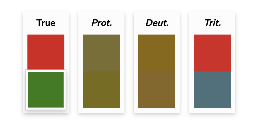
Since red-green is by far the most common form of color blindness, this combination is the riskiest. This is especially critical for interfaces — think error states, success messages, charts, and dashboards. "Stoplight" palettes (red/yellow/green) are particularly hard to decode for many users. When in doubt, don't rely on the color alone to do the work.
2. Lead with contrast, not just hue
When two colors are similar in brightness and saturation, they become very hard to distinguish regardless of their hue. High contrast — light versus dark — is far more universally readable than the difference between two mid-toned colors. Even if someone can't tell red from green, they can usually read dark text on a light background just fine.
3. Reach for complimentary colors

Blue and orange are complementary colors on the color wheel and one of the most consistently legible combinations across all types of color vision deficiency. It's a natural go-to for accessible design, and honestly, it looks great too.
4. Embrace gray
Neutrals, particularly grays, are interpreted consistently across nearly all forms of color blindness. A well-placed gray can anchor a palette, improve legibility, and make your more vibrant colors pop — all while keeping things accessible.
5. Don’t let color carry meaning alone
This is the big one. Whenever color is communicating something (an error, a category, a data point, a status) pair it with a secondary signal. Labels, icons, patterns, textures, or shapes all work. A red X and a green checkmark communicate far more clearly than red and green alone. Your charts should be readable in grayscale. Your forms should show error text, not just a red border.
3 Free Tools to Test Your Brand Right Now
You don't have to guess how your brand looks to someone with color blindness — you can simulate it in minutes with these tools:
Palette Checker — davidmathlogic.com/colorblind — plug in your brand hex codes and see how they appear across different types of color blindness
Colorblinding (Chrome Extension) — Chrome Web Store — simulate color blindness on any live website, including your own, with one click
Coblis Image Simulator — color-blindness.com/coblis — upload any image and see how it renders across eight different types of color vision deficiency
Bonus: whocanuse.com is excellent for checking whether specific color combinations meet WCAG contrast requirements, and it shows you exactly which user groups are affected by each pairing.
The Bigger Picture
Making your brand more color blind friendly isn't about limiting your creativity, it's about making sure your creativity actually lands with everyone it's meant to reach. The most beautifully designed brand in the world isn't doing its job if a significant part of your audience can't decode it.
Small changes make a big difference here. Audit one thing at a time: start with your website CTAs, then check your social graphics, then look at any data visualizations you use. Build it into your process going forward, and it stops being extra work and starts being just good design.
Important Disclaimer: The world of design accessibility is incredibly nuanced and only recently studied. Honey Creative is not a certified expert but understands that color contrast accessibility should always be a priority when designing.
Ready to dig deeper into brand accessibility? We've put together a full checklist covering everything from your website to your social media to your in-person materials — grab it here.
References: National Eye Institute, World Health Organization, WCAG 2.1 Guidelines


Continue Reading