
Rebranding
Up Top Acres
The Challenge
Up Top Acres needed a brand refresh that reflected their mission and values while feeling professional, natural, and cohesive. Their messaging lacked clarity, and their online presence didn’t fully capture their expertise in sustainable urban farming.
Our Approach
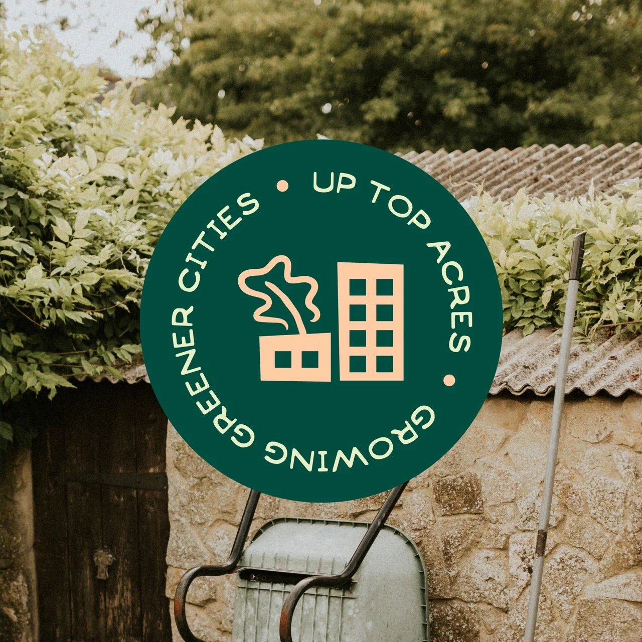
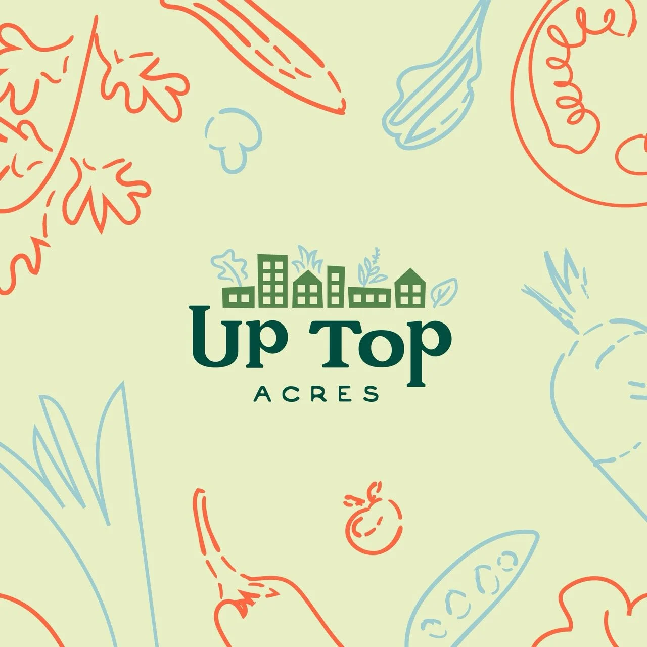
We crafted a refined brand strategy that balanced professionalism with approachability, using thoughtful patterns, a harmonious color palette, and intentional messaging. To mirror their new messaging of Growing Greener Cities, we infused the branding with a lively and colorful aesthetic. This brought the same vibrancy and energy to their identity that they bring to urban spaces. The result is a brand that feels fresh, inviting, and seamlessly aligned with their vision.
Services
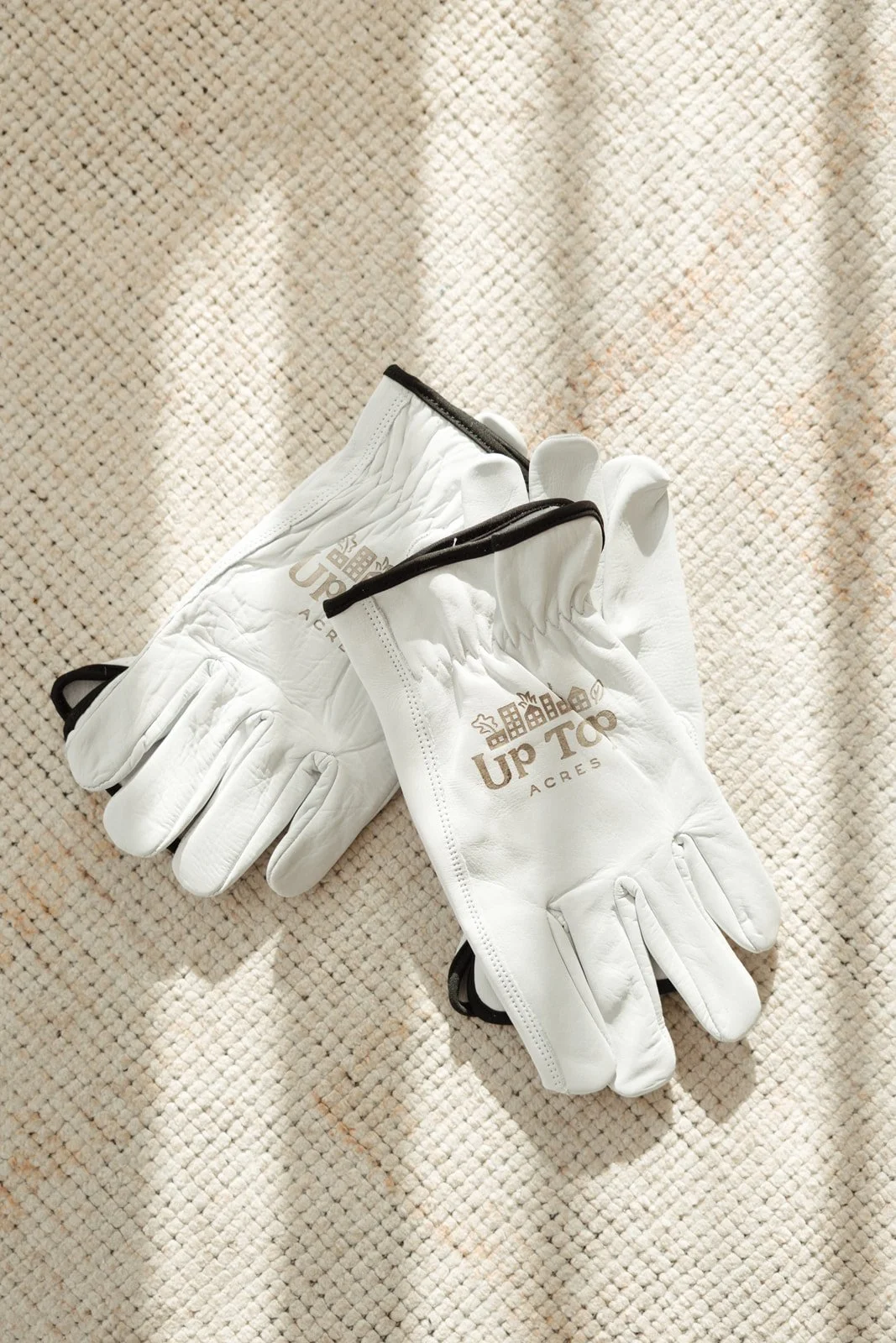
Rebranding + Website,
Honey-Do Days
Brand Strategy
Brand Design
Brand Collateral
Website Design and Development
Quarterly Honey-Do Days


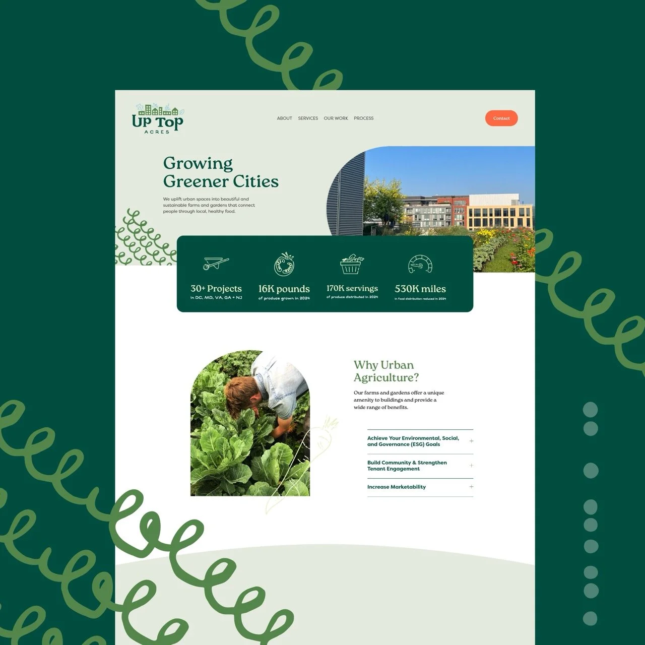
Visit the full site online at uptopacres.com